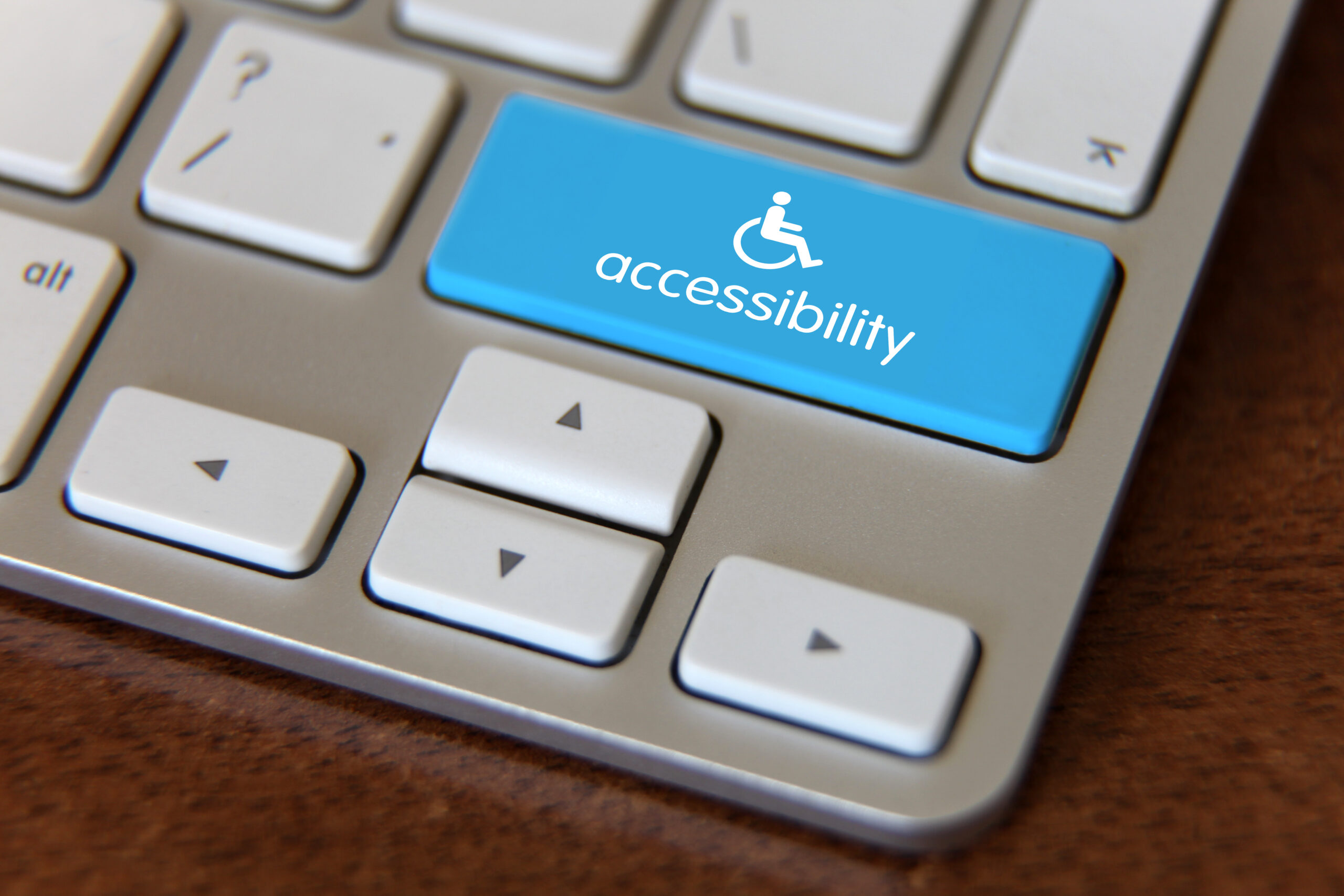
How Website Accessibility Could Increase Your Revenue and Much More
The goal of website accessibility is to ensure the content on your website or app is consumable by everyone.
We say ‘consume’ because it should be easy for users to see and hear all information. No matter their physical, cognitive, visual, photosensitive, or hearing ability.
Having an inaccessible website could mean you’re:
- frustrating users
- losing revenue
- impacting search rankings
- and even breaking the law.
What is website accessibility?
Website accessibility means no exclusions or barriers for people using the web. It’s giving equal opportunity to all. It’s making your website open and understood by everyone.
To be accessible, a website should meet four principles. Perceivable, operable, understandable, and robust. There are testable success criteria and have three rating levels.
To build an inclusive web we need to understand our users fully – all of them. It means that we give them the content they need, in a way that they need it, and in a format that works for them.
Content Design and SEO best practices all feed into this.
How many people does website accessibility affect?
Billions. Think your website doesn’t need to be accessible because your target audience “isn’t disabled”? You’re wrong. There are:
- 14.1 million people with a registered disability in the UK
- 8.6 million internet users with access needs in the UK
- 3 million people in Britain have some degree of colour blindness
- 1.5 million people in the UK with a learning disability
- 87,000 profoundly deaf people in the UK who use British Sign Language
- 11 million people in the UK have some degree of hearing loss. Include a video without a transcript or subtitles, and you’ll be excluding 1 in 6 people.

The ability to access content can be situational, temporary or permanent. For example, one person may have a permanent hearing impairment, while another person might just be on a loud train without headphones. But, neither person can consume your video if you have no subtitles or transcript. Cater for all your potential users and make your content accessible to all. It’s a no-brainer.
Step into their shoes. Check out the Web Disability Simulator. It’s a Chrome extension that can show you how a page will look with various impairments.
Why should it be a priority?
Here’s why you need to start prioritising accessibility for your website content, design and development.
It’s required
Public sector organisations have a legal duty to meet accessibility regulations. They must make their websites accessible and publish an accessibility statement. Mobile apps need to meet the regulations by 23 June 2021.
The European Accessibility Act 2019 requires websites to have compatibility with assistive technologies. They must also present content in an appropriate format for users.
The UK Equality Act 2010 says your site must anticipate and make ‘reasonable adjustments’ for disabled customer needs.
The Americans Disability Act (ADA) says websites with inaccessible components are discriminatory. They also violate Title III of the law.
Let’s not forget companies like Nike and Domino’s Pizza in the U.S. getting sued for being inaccessible to screen readers in recent years. Lawsuits like these are estimated to cost over $25,000. Is it worth the risk?
You’re losing money
71% of disabled people will abandon websites that are difficult to use.
The total spending power of families with at least one disabled person is estimated at £249 billion a year. That’s a lot of people to ignore and a lot of money to lose out on.
Think of all those users who can’t consume your content because they cannot access it. They’ll bounce. Bounce rates due to inaccessible websites cause around £12bn worth of lost revenue each year. It’s simple. An accessible website can increase your conversions and revenue.
It complements SEO
Change the conversation. Accessibility isn’t a trend and it isn’t only a problem for designers and developers. It’s a team effort, and understanding why accessible content design on a webpage matters for SEO can help drive that conversation.
W3C says that: “Case studies show that accessible websites have better search results, reduced maintenance costs, and increased reach among other benefits.”
This is due to the fact that so many features considered when making a web page accessible actually support Search Engine Optimisation.
For example, with internal linking: Signposting where your link is pointing to gives Google important information about the destination page. But, it also signposts where the link leads for those using screen readers.
Read on to find out the other ways web accessibility can assist your SEO.
Top ways to make a website accessible
A study from Web Aim found 98% of homepages had detectable Web Content Accessibility Guidelines (WCAG) failures. 97% of the deeper content pages also failed accessibility testing.
WCAG provides a set of shared standards for individuals and organisations around the world. Here we explain some of the top actionable takeaways. All of these correlate to good user-centred content design and SEO best practices.
Always provide a text alternative for visuals
Let’s start with one of the most obvious ones.
- Alt text for images: For SEO, keyword optimised alt text in the markup/code for every image is ideal. However, the alt text should make sense, it should accurately describe the image, and it should be relevant. Avoid keyword stuffing. See an example in the image.

- Describe the image on the page: For more complex images, caption them on the body copy of the page.
- Transcripts for videos and audio: This helps everyone viewing the video/audio understand what it’s about. Whether you’re deaf, have a temporary ear infection or your headphones don’t work. It also allows you to optimise the page for organic search.
- Using symbols and text, not just colours: If you have a chart or map, use both colours and symbols. Consider those with colour blindness. Don’t use colour as the only way of conveying information or identifying content. Find out more about improving colour accessibility in apps with this article from Hedgehog Labs.

Readability
- Avoid jargon, or acronyms without explanation
- Avoid special characters like ‘&’
- Break up walls of complex text. Use short, Plain English sentences.
- Avoid confusing formatting like underlining text. Only use this for hyperlinks
- Get your colour contrast ratio right
- Take a look at the full list of Readability Guidelines
Clear content structure
Your site structure should have clear navigation, breadcrumbs and sitemaps. The page structure should be logical. It should assist users to navigate through the information.
- Page titles: Should be optimised with the user in mind. Using the brand name at the start of every page can be confusing for screen readers looking at a set of tabs
- Subheadings: Assistive technologies like screen readers work a bit like crawlers. They’ll scan and navigate the page and use headings as a guide. Only use one H1, and use a hierarchical structure e.g. don’t jump from h2 to h4.
Give the user control
- Auto-start videos: Avoid videos that start on a timer or without the user clicking. Automated videos can be distressing or distracting to some. Ensure that there is a pause button. The same also applies to automatic image carousels.
- User interactions: Cut them down. Do you have an accordion or some kind of drop down? Make sure it’s all in the source code so that bots and screen readers can read the content.
Make hyperlinks accessible
- Link text: Should be descriptive and meaningful. Not ‘click here’ or ‘read more’. Do not use the same link text to link to different places. This is also used by crawlers to understand the context of the destination page
- Page URLs: Make sure these are easy to understand and describe the page
- Breadcrumb links: Make these descriptive for screen readers. Place them in the same location across the website
Ensure PDFs are accessible
- Inaccessible vs accessible: For example, an inaccessible PDF might be a picture or the scan of a printed document. A Word document can usually be converted to an accessible PDF
- Tag up the contents: Screen readers will then know how to interpret it. Use a descriptive title and a clear structure. Use alt text for your images.
- Better still, convert your PDF to an HTML webpage. This is better for users on all devices and organic search.
- Read more about how to make your PDF more accessible here.
What’s next?
Check your content using an accessibility checker or conduct an audit. Get in touch for help with your accessibility, user experience, and content design, and stop losing out on revenue.

