
How We Increased Our WordPress Site’s PageSpeed Score by 55%
Everyone who runs a WordPress website has had this experience; the site has grown, the organisation has scaled and the website has now been in active development for years. Business priorities have changed and, as a result, so has your website content, and with that your WordPress theme.
WordPress was initially created as a blogging platform and as such it was not designed with today’s web performance standards in mind. Since Google’s announcement that as of July 2018 pagespeed will be a factor in mobile search rankings, it’s now more important than ever to make sure that your WordPress site is as performant as possible. As is common with WordPress websites as we extended and redeveloped our theme, our site’s performance suffered. To counteract these problems, we refactored and revised our theme configuration and development workflow and made our site performant by today’s standards.
By refactoring and revising our website configuration and our approach to its development, our site is now performant by today’s standards. By putting in place these measures and increasing our site’s pagespeed by 55%, we’ve created this blog post to document the process.
Performance Analysis
The first step is to determine your performance baseline. There are a few essential tools to measure your site’s performance. For the purposes of this blog, we’re going to use Google’s insights tool https://developers.google.com/speed/pagespeed/insights/ and laterally https://www.webpagetest.org. This blog refers to the results of the optimisation on our homepage, but the performance gains apply across the piste.


The news for us was not so good. On our homepage www.ayima.com, we had a Mobile PageSpeed score of 64/100 (Poor) and a Desktop rating of 71/100 (Needs Work). Pagespeed insights gave us the following recommendations:
- Eliminate render-blocking JavaScript and CSS in above-the-fold content
- Leverage browser caching
- Minify JavaScript
- Optimize images
- Prioritize visible content
Tooling
The largest performance gains are to be made by improving our development workflow and building automated performance optimisation steps into our development process. Our WordPress site runs a custom theme built on the WordPress Timber Framework. We write all of our Theme’s styles in SCSS and compile them to CSS using GULP. Our Development Environment is a Vagrant Box that we use on the custom local domain www.ayima.develop
WordPress Housekeeping
First things first: Before undertaking any work on a WordPress website, we always perform the routine maintenance. We deactivated unused plugins to make sure any JavaScript or styles they were loading is gone, and then upgraded WordPress to the latest version and updated all of our installed plugins.
Image Optimisation
We had a number of images for decorative purposes that have been built into our theme that were not completely compressed. When using Pagespeed Insights (or lighthouse) you may notice the warning “Uncompressed Images.” Be careful with this warning and use your best judgement as the algorithm can be a little trigger happy with optimisation. I’d recommend downloading the optimised assets to determine the quality. In the case of transparent PNGs, you may find that aggressive optimisation with leave your image with visual artefacts. In those cases it’s best to optimise the images manually in Photoshop. We also add those images to our gulp-sprite pipeline to stitch them together and save more precious HTTP requests.
JavaScript Optimisation & Loading in the Footer
The first item on the list to deal with is optimising the javascript that our theme is loading. Each one of the script files that is currently loaded is a HTTP request. In order to save on HTTP requests, we built a new deployment task to concatenate all our javascript files (smoosh them together) using gulp. We’re leveraging the packages gulp-concat, and gulp-uglify so first we required them at the head of our gulp file and “npm install” them.
When concatenating scripts, the most important consideration is load order. It’s vital to ensure that your dependencies are loaded to prevent errors when concatenating your scripts. We took the approach of having a vendor folder inside our /script folder to organise our plugins and dependencies. In our “js” gulp task below, first we concatenate and minify all of our custom scripts into a file called ‘j.js’. We then need to ensure that our core dependencies are always packaged first (instead of alphabetically by default). Gulp.src accepts an array of file paths that it will process the files in order into the concatenated file ‘p.js’:
gulp.task('js', function() {
    gulp.src('./scripts/*.js')
        .pipe(uglify())
        .pipe(size({ gzip: true, showFiles: true }))
        .pipe(concat('j.js'))
        .pipe(gulp.dest('./assets/js'));

    gulp.src([
        'scripts/vendor/matchMedia.js',
        'scripts/vendor/matchMedia.addListener.js',
        'scripts/vendor/jquery.js',
        'scripts/vendor/prism.js',
        'scripts/vendor/foundation.js',
        'scripts/vendor/modestmaps.min.js',
        'scripts/vendor/modestmaps.markers.js',
        'scripts/vendor/*.js'
    ])
    .pipe(uglify())
    .pipe(size({ gzip: true, showFiles: true }))
    .pipe(concat('p.js'))
    .pipe(gulp.dest('./assets/js'));
});
The next important stage is to dequeue WordPress’s default version of JQuery and then move our newly concatenated and minified javascript to the footer to prevent blocking the page from rendering when the site first loads. In our theme’s functions.php file, we added a function to load our new compiled scripts with our dependencies file ‘p.js’ first followed by our custom file ‘j.js’:
function load_scripts() {
// we're going to dequeue jquery as it's in our concatenated scripts
	wp_deregister_script( 'jquery' );
// concatenated production scripts Run 'gulp js' to update
	wp_enqueue_script('plugins', THEME_URL . '/assets/js/p.js', '', '1.19', true);
	wp_enqueue_script('script', THEME_URL . '/assets/js/j.js', '', '1.21', true);
}
Note the last ‘true’ in the wp_enqueue_script function; this instructs WordPress to load the script in the footer.
There is a Gotcha here. Because we’re now loading our dependencies in the wp_footer(), any inline scripts called in our page template’s body will fail as they will be called before our dependencies are loaded. As a result, we need a way to move inline scripts to the footer after our ‘p.js’ file has loaded. We implemented a twig helper for the wp_add_inline_script() function to solve this issue in functions.php:
function print_my_inline_script($inline) {
  wp_add_inline_script( 'script', $inline );
}
add_action( 'wp_footer', 'print_my_inline_script' );
Here’s an example of it in use on our New York office’s page, where we use an inline script to set map Coordinates:
{% set inlineScript %}
var latlng = new MM.Location(40.7240, -73.9964);
{% endset %}
{{function('print_my_inline_script', inlineScript)}}
If you’re not using Twig, this is also relatively trivial to implement in PHP as explained by Steven Dobbelaere here
Production concatenation, is all well and good, but in development we want to be able to inspect and navigate the full source in our Browser. We can now modify our load_scripts() function to add conditional loading so that if the site url is our local .develop domain it enqueues the uncompressed and unconcatenated scripts. In functions.php:
if (isset($_SERVER['SERVER_NAME']) && $_SERVER['SERVER_NAME'] == 'ayima.develop') {

	function load_scripts() {
		wp_enqueue_script('matchMedia.js', THEME_URL . '/scripts/vendor/matchMedia.js', '', '1.0');
[... All other Dependencies enqueued here ...]

   }
}  else {
	function load_scripts() {
// we're going to dequeue jquery as it%u2019s in our concatenated scripts
	wp_deregister_script( 'jquery' );
// concatenated production scripts Run 'gulp js' to update
	wp_enqueue_script('plugins', THEME_URL . '/assets/js/p.js', '', '1.19', true);
	wp_enqueue_script('script', THEME_URL . '/assets/js/j.js', '', '1.21', true);
    }
}
Critical Styles in WordPress
Critical styles are a technique whereby only the styles that are required to render the part of the web page that appears first are loaded in the sites head and all of the other styles are moved to the bottom of the page just before the closing <body> tag. Critical Styles are like the old joke about the remote worker: They may be wearing a shirt and tie on the video conference, but underneath the desk they’re still wearing their pyjamas. This means that on slower connections the page is rendered and usable before all of the rest of the site’s styles, and this trick dramatically increases the page’s perceived performance.
Implementing Critical CSS addresses two of the recommendations made by insights: “Eliminate render-blocking JavaScript and CSS in above-the-fold content” and “Prioritize visible content”. There are a number of approaches to implementing Critical CSS such as:
- Manually maintaining styles by using a SASS function to compile separate style sheets to be included in templates (as described by Ben Edwards here).
- Subscription services like https://criticalcss.com which generate CSS for a monthly fee.
- Automated workflows which use headless browsers to automatically grab styles from your rendered page like Addy Osmani’s Critical and the Filament Groups Critical CSS.
Because our site is mature and we already have a Gulp pipeline for development, we chose to implement Addy Osmani’s Critical.
Configuring Critical for a Custom WordPress theme
Installing means adding another require statement ( ‘var critical = require(‘critical’);’ ) to the head of our Gulpfile and again running ‘npm install’. Critical accepts a number of options and we need to configure the dimensions that the headless browser will use to gather our critical styles. Our site is built on Zurb’s Foundation framework, so it’s easy for us to use the screen widths that our media queries target combined with common device heights as a guide for our critical styles. We can add this array in our gulp.js file:
var dimensionSettings = [{
    width: 639,
    height: 667
}, {
    width: 641,
    height: 1024
}, {
    width: 1024,
    height: 1366
}, {
    width: 1025,
    height: 1366
}, {
    width: 1441,
    height: 900
}, {
    width: 1921,
    height: 1175
}];
The next stage is to build a gulp task for each of our templates to generate our critical CSS, the following is the gulp task that creates the critical styles for our homepage:
gulp.task('criticalhome', function(cb) {
    critical.generate({
        base: 'views/critical-styles/',
        src: "http://ayima.develop",
        dest: "home.css",
        dimensions: dimensionSettings,
        minify: true,
        ignore: ['@font-face']
    }, cb);
});
Important things to note that the src setting where we use our vagrant localhost URL and the fact that we are ignoring fontface to prevent visual jitter caused when custom font files loads twice. A big gotcha here is pathing assets: We organise our theme assets by component not template, so as we used relative pathing in our CSS, we needed to repath assets absolutely (as we’re going to include the output CSS in the head of our templates). If you organise your assets by template, you can pass in the pathPrefix option to repath your url()s.
So far so good. We can now run ‘gulp criticalhome’ and we get a home.css file, so now we need to include these styles in the head of our template. For this we use the twig helper ‘source’ in our home.twig file:
{% block before_wp_head %}
    <style>{{ source('critical-styles/home.css') }}</style>
{% endblock %}
If you’re not using twig you can implement this in php by following the example from the codex here
Now we need to replicate the gulp critical task for each one of our templates. Ayima.com uses 17 custom templates, which means we must replicate the the critical configuration for each one changing the ‘src’ and ‘dest’ setting for each. Next, we run the task to generate the file, and then include it in the head of each template. That’s all well and good, but what if we want to make a global change to the top of site, like redesigning our header or navigation? We need to build a way to run all of the critical tasks in sequence, for this we add ‘var runSequence = require(‘run-sequence’);’ to our gulpfile and again ‘npm install’. With this package, we can chain all of our critical tasks together to so they run one after another.
gulp.task('critical', function(cb) {
    runSequence('criticalhome',  'criticalseo',  'criticallocation', 'criticaltools', 'criticalnews', 'criticalblog', 'criticalblogpost', 'criticaljobs', 'criticalinterns', 'criticalinvestors', 'criticalinvestorsnews', 'criticalinvestorscsr', 'criticalinvestorsfinancial', 'criticalinvestorsboard', 'criticalcontact', 'criticalservices', 'criticalabout', cb);
});
This functionality is built into gulp 4, but since our gulp pipeline is stable & working we chose not to upgrade
Now we can simply run the command ‘gulp critical’ and all of the files for all of our templates will be automatically generated. There are a couple of caveats to this approach and as always your mileage may vary. In practice, our vagrant environment choked and considering we’re trying to get a little virtualbox to handle 102 browsers pointed at it at once, this is not surprising. In practice, increasing the resources devoted to the virtual box and increasing the ‘timeout’ setting in the critical.generate() functions for each template yielded better results. However, this was not 100% reliable and sometimes required running the task individually for some templates. Pointing the critical tasks at our staging server was much more successful.
The final stage is moving our main.css file to the footer of the site. This is not yet supported in WordPress, so we can not use the core wordpress wp_enqueue_style() function and here we have to roll our own in functions.php:
function styles_in_wp_foot() {
	echo '<link rel="stylesheet" href="https://fonts.googleapis.com/css?family=Lato:400,700" type="text/css" media="all" />';
	echo '<link rel="stylesheet" href="'.THEME_URL.'/assets/styles/main.css?v='.AYIMA_MAIN_CSS_VERSION.'" type="text/css" media="all" />';
}
All credit to Ryan T. Venge for featuring this technique in his excellent blog on CriticalCSS here
What we left out
The more attentive of you will have noticed that we did not address “Leverage browser caching” from Pagespeed. There is a good reason that we neglected this option. On Ayima.com, we do some simple localisation on the site using Cloudflare’s IP Geolocation, so implementing the standard caching methods available with WordPress plugins like W3 Total Cache or WP Super Cache would not be practical. These plugins are highly recommended for almost all WordPress sites, but ours is an exception. As an alternative, we implemented PHP caching with APC which yielded good results.
Final Analysis
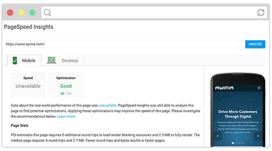
Success! After all of our improvements, our pagespeed score has increased to 99/100 on mobile and 92/100 on Desktop. In the future, we’ll be able to make minor gains by implementing lazy-loaded images, but it’s unlikely that we’ll see dramatic gains without undertaking a performance-focused redesign that favours the use vectors over raster images.