Building Your Site’s Custom CTR Curve
This guide details how to generate custom Click-Through Rate (CTR) curves using data from Google Search Console. In doing this we’ll be able to:
- Identify outliers to find queries that result in unusually high and low click-through rates for your site.
- Make personalized forecasts of ranking change impacts.
- Measure the effect of improvements made to title tags, meta descriptions and rich results.
We’ll use a Google Sheets add-on to access the Search Console API and extract data, then proceed with the analysis in Excel.
If you’re on board then go ahead and log into your Google Search Console Account and follow the steps below to extract data through the API!
If you need some convincing, consider the following eCommerce-site example to illustrate the potential usefulness of this analysis.
- After plotting the CTR curve you see outlier pages that have unusually low CTR. You notice these pages have poor meta-descriptions and no rich markup.
- To formulate a business-case for implementing better meta-descriptions and rich markup, you forecast the increase in clicks to those pages. Using the site’s custom CTR curve (rather than generic or legacy click-curve data, e.g. AOL) you are able to maximize the accuracy of this forecast.
- Your proposed changes end up getting implemented. A few months pass and you want to see the effects. Generating the new CTR curve for the optimized pages, you see a marketable improvement compared to before. Your work has paid off and you have the data to prove it.
Part 1: Extract Data from Search Console
Firstly, we need to release data from the confines of Search Console, a task easily accomplished using the Search Analytics add-on for Google sheets.

If you already have this installed, open up a new sheet and skip to Step 2. Otherwise continue with Step 1.
Step 1: Install the Sheets Add-on
After signing into Search Console, open up the Search Analytics Sheets add-on and click the “+” box to integrate it with your Google account. You should see a new sheet open and a dialog like this will appear:

After authenticating the add-on, it can be accessed from any new sheet through the toolbar.

Step 2: Make API Request
You are now ready to request data through the Search Console API. Select your site and the desired date range, filters and dimensions to group by. In this case, I have selected the maximum allowable date range of 90 days and grouped by Query (keyword), as well as Page. For the purposes of looking at CTR (i.e. this blog post) I would not suggest grouping by Date; this way each Query & Page combination will be represented by only one point on the scatter plots we generate in Part 2 and 3. Finally, filters can be applied here to do things like remove branded terms and segment on a given device type or country.

Once you are happy with the selections, click “Request Data” and allow the sheet to populate with your sweet sweet data. So long as you did not group by Date (i.e. if you are following along with me) then you should be looking at Clicks, Impressions, CTR, and Position aggregated by Query and Page.
Step 3: Export Data
At this point, you are welcome to attempt continuing the analysis in sheets, however, I find Excel much better for what we are going to do. Export the table in csv format (or xlsx) so we can open it locally in Excel.

What does the Search Console CTR metric measure?
At a glance it might appear to represent the number of Clicks per search, however this is not true. The CTR is simply defined as the number of Clicks divided by the number of Impressions. The distinction is very important and greatly affects our interpretation of the results to follow.
Part 2: Generate the CTR Curve
Step 1: Make a Scatter Plot
We are going to make a scatter plot showing CTR as a function of Position. Do this as you see fit for your version of Excel; I find it easiest to cut and paste the CTR data to the right of the Position data (allowing the axes to come out right) and then select both columns and click Recommended Charts -> Scatter from the Insert tab.

After labeling and selecting your favorite style you should be left with something like this:

Increasing marker transparency allows you to get that heat map effect.
Step 2: Add a Trend Line
An easy way to generate the CTR curve is by adding a trend line. From the Chart Design tab we can select Add Chart Element -> Trendline -> More Trendline Options and then select the Power trend line.

The Power option may be grayed out, which happens when you have CTR values equal to 0. In this case you can filter them out: select all of the data, click Filter in the Data tab, and filter on CTR > 0. Alternatively, you may find a decent fit from the Logarithmic option which will not be grayed.

As promised, we have calculated your site’s custom CTR curve! If this isn’t a satisfying result for you, then don’t worry; we’ll take a different approach to the problem and generate a new curve later in the guide. However, if you’re at least mildly pleased with this result then carry on as we identify outliners to find your site’s best and worst performing pages in terms of CTR.
Part 3: Calculate Residuals to find Outliers
Step 1: Do the Calculation
The residual values are defined as $latex ,r_i = y_i – hat{y}_i,$ where $latex ,y,$ is the actual CTR, $latex ,hat{y},$ is the predicted CTR and $latex ,i,$ identifies the data point. For my Power trend-line, Excel calculated the predicted CTR as
where $latex ,x,$ is the Position. With this in mind, we can calculate the residuals for each row with the Excel formula “= [CTR] – (0.1966*[Position]^(-0.735))” where [CTR] and [Position] should be changed to the corresponding cells in each row. Make sure to use the coefficients for your trend line in place of mine.

Step 2: Make a Scatter Plot to Check your Calculation
Plotting the residuals as a function of Position you should see something like this:

Step 3: Identify and Analyze Outliers
The residuals quantify how well each data point fits the trend line. For a dataset with perfect fit, each residual value would be zero. In our case, where the target variable is CTR, the residuals can be interpreted as follows:
- Large positive residual = higher CTR than predicted, page is performing well for given search term
- Large negative residual = lower CTR than predicted, page is performing poorly for given search term
We can now hunt down the outliers. Add your newly calculated residual column to the filter by selecting all data and clicking on the Filter button in the Data tab.

Now we can sort by the Residual column to find well-performing pages (high positive values) and poorly-performing pages (high negative values). We can focus on the most important pages by filtering for a given number of Impressions and narrow our results to specific Positions if desired. For example, filter on Query and Page combinations with over 100 Impressions that rank on page 2 in the SERP listings (Positions 11-20).
Part 4: Project the Impact of Ranking Changes
It can be desirable to report predicted impacts of SEO based on keyword-ranking changes. This might involve projecting how many more clicks a Query and Page combination will get if the Position is increased by a given amount. It’s tempting in this situation to defer to outdated CTR data such as that from AOL’s 2006 leak:

Or better yet, something like this. However, I prefer to base my projections on data coming directly from the site, using my own calculations. If you have come this far, then it really isn’t very difficult.
Step 1: Round Positions to the Nearest Integer
Firstly, we need to discretize the Position data; let’s add a new column for this using the formula “=ROUND([Position], 0)” where [Position] should be replaced with the corresponding cell for each row.

Step 2: Aggregate Data using a Pivot Table
Next, we are going to use a Pivot table to calculate the average CTR for each discrete Position. Select all the data and click PivotTable in the Insert tab (you can filter out rows under some threshold for Impressions first). Click “OK” on the popup dialog to add the pivot table to a new tab. You will be presented with a new dialog where metrics and dimensions can be dragged into different boxes. I have done this as seen below, dragging the CTR field three times into the Values box and changing the type of aggregation for each by clicking on the circular i’s.

Step 3: Plot the Results
By including the standard deviation, we see how well the average CTR for each Position should be trusted. Using these standard deviations values to set custom error bars, my discrete CTR curve looks like this:

For this data, as can be seen, the Position 1 queries average a CTR of about 37% and the error bars tell us that 68% of these queries have CTR between roughly 10% and 63%. The CTR for other Positions should be interpreted analogously.
Step 4: Forecast the Impact of Ranking Changes
There are two approaches I have used in the past, in each case the goal is to estimate the number of Clicks for a keyword given its forecasted Position. In either case there is an element of guesswork involved. The Impressions method goes as follows:
- Get the number of Impressions for the keyword at its current Position.
- Project the number of Impressions at the forecasted Positon.
- Use the average CTR at the forecasted Position along with the projected number of Impressions to forecast the number of Clicks.
The other method involves Search Volumes, which are estimated for a wide range of queries by services like SEMrush. This method goes as follows:
- Get the estimated Search Volume for the keyword.
- Convert the CTR from Clicks / Impressions (as visualized above) to Clicks / Search Volume. This can be done using an ad-hoc damping factor as seen below.
- Use the newly calculated Clicks / Search CTR along with the projected keyword Position to forecast the number of Clicks.
For both methods the second step involves manual guesswork. For the Impressions method this means building an algorithm that can estimate how Impressions will change when going from Position A to Position B. Although this is less than ideal, it’s beneficial to start with the actual number of Impressions as measured by Google.
The Search Volume method is more straight forward, but suffers from having to rely on (in many cases poorly) estimated Search Volume. For example, to calculate the Clicks / Search for the first page of search results we could estimate that each search leads to an average of:
- 1 Impression for the Positions 1-4
- 1/2 Impression for Positions 5-7
- 1/4 Impression for Position 8-10
Using these ad-hoc estimates as a damping factor, the Average Clicks / Search for page-one queries in my data-set looks like this:

Here we are comparing branded and non-branded Queries. In this case we can see that branded Queries do not have a significant effect on CTR other than for Position 1.
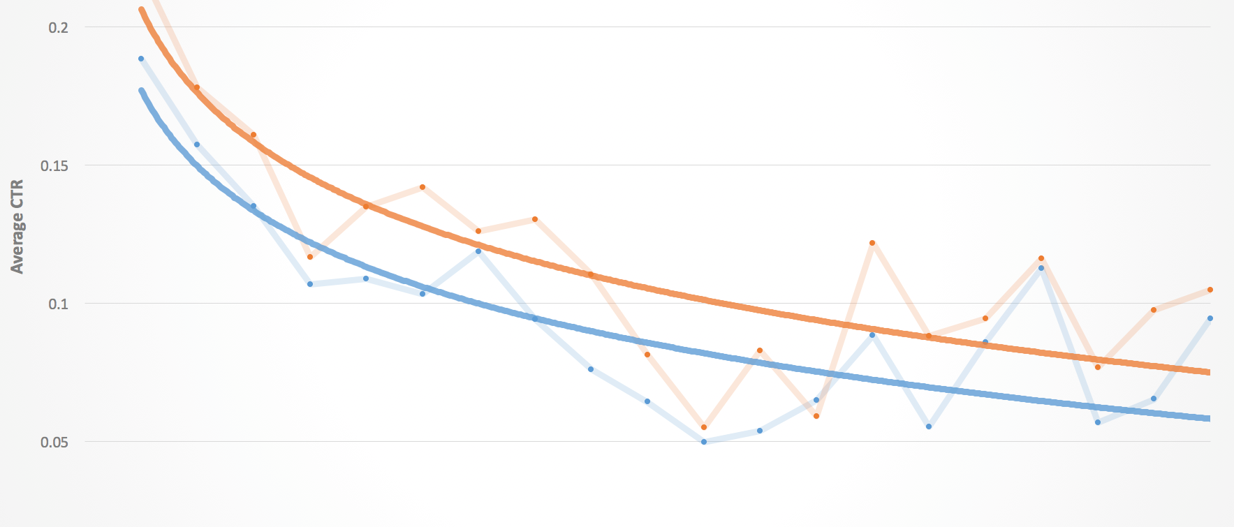
Part 5: Measure the effect of SEO Implementations
Having discussed the projected impact of SEO, let’s now see how CTR can be used to visualize the actual impact of these changes. This is particularly relevant for changes that affect the appearance of your site on the SERP, that is to say, title tags, meta descriptions and rich markup.
It can be difficult to see changes in the number of Impressions, Clicks, or Positions as a result of changing your site’s appearance on SERPs. Furthermore, assuming you are implementing multiple SEO solutions in parallel, it’s not ideal to attribute changes in the search analytics to any one solution. That being said, since CTR will be largely influenced by the site’s appearance on the SERP, this data may offer a way to highlight those effects.
Our proposed technique involves doing the above analysis on two datasets, where one is taken from a time range before implementing changes to title tags, meta descriptions and/or rich snippets, and the other is taken from the time range after the changes.

Getting this data is easy thanks to the Sheets add-on, which has a date filter option. However, since Search Console only stores this data for 90 days, the “Before” dataset should be saved prior to making changes to the site. Then after allowing Google time to index the changes, the “After” dataset can be composed of up to three months of user-data.
The site’s improved SERP appearance should lead to a visible increase in CTR across all Positions. The rational is simple: more people who register an Impression will click through to the page. If only changing certain pages, it’s best to focus on those by filtering the data when making the API request. That way you are minimizing the amount of noise in the results.
Summary
In an attempt to find meaningful insights from Google Search Console’s CTR data, we have walked through a high-level analysis in Excel. We began by gathering data using the Search Console API and calculating a simple CTR curve. We used this curve to determine residuals, which were leveraged to contrast the best and worst performing pages in terms of CTR. Then we discretized the Position data and calculated the average CTR for each Position, including the standard deviation as an error measure for each Position. Finally, we applied a dampening factor to convert CTRs for the top 10 Positions from Clicks / Impression to Clicks / Search.
Thanks for following along! If you apply this analysis to your own site then we would love to hear about it. Tweet us your story @ayima.
If you would like help using data like this to form your company’s SEO strategy then get in touch!

